

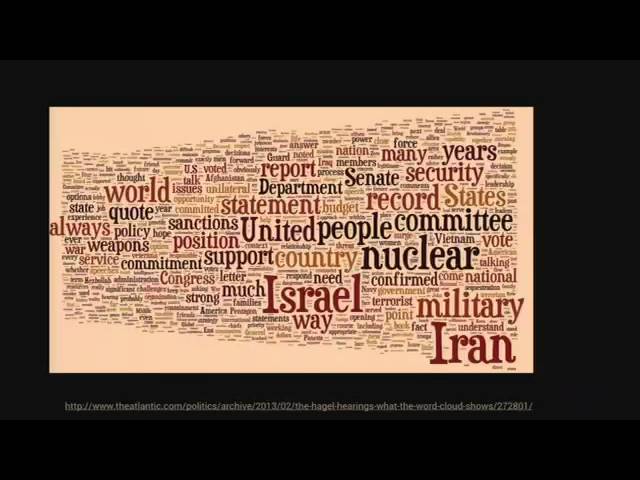
On wordclouds and 3D charts -- and why sometimes it's ok to break rules in data visualization.
There are lots of lists of do's and don'ts in news graphics, but while being helpful in theory, many of these static rules don't pass the test of reality. In this session we'll look at some more complex graphics outside the comfort zone of simple charts, and explore the underlying design choices and considerations.
Audience:
This session is recommended for journalists with a basic level of statistical and/or graphical skills.
Organised in association with the European Journalism Centre and Open Knowledge Foundation